Pages

Thursday, May 31, 2012

typography (Violet Vines)


1. The name of my font is "Violet Vines."  The name relates by having it purple and by having little things come off of the letters that makes them look like vines or branches.
2. The tyle of my font is more of a handwriting look.
3. I didn't really have an inspiration, I wanted something I could get done with fast and when I started doing this one I liked how it looked and it went by quick.
4. my font relates to my personality by having it be a type of handwriting look, not to fancy, but not to cut.
5. I had no struggle with it.
6. having it look the way I wanted it to.
7. To be honest I would not want to make another one.

Monday, May 14, 2012

1. The type of font used for something describes and creates a feeling by what it looks like.  If it's something like nike it's straight forward, showing this is the way to go, nothing else.  If it was something more like a calligraphy it makes a more warm feeling like a romantic feeling.  I never really had a big reaction to font because I don't look at in a deep way, I may not have liked a certain font but that's just because I'm kind of picky.

2. If I were typing a paper I would probably use times new roman but other then that I don't care what font I'm using.  Whatever it is on the computer that's what I use.

3.I feel that the look of a font depends on what the subject is and who it's for.  If it's for a friend or something you don't really care about what the font looks like but if it was someone like a teacher you're going to want them to be able to read it well and clear.  I would say politics affect the art design by everything being really neat.  Their all so stern everything has to be professional.

4. I'm going to have to go with target but it's a kind of hard to say because they have changed their font.  I don't know what I would change, I guess I might change how everything is kind of little kid. I feel like it just needs to be a little more adult.

5. The video didn't really affect me. I mean I know now that people are very into font and how a letter looks and really gets done on a business if they think theirs looks bad.  I can't really say it changed my aspects on life because I could care less what font I use.

6. This film showed me that if you wanna be serious about your business you are going to have to find a good font to be able to get business and be successful.

Wednesday, April 25, 2012

Currency


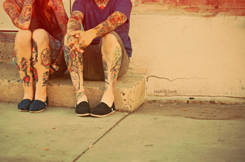
I included the photos I did because I think expression is one of the most important things.  I may know people who don't like tattoo's and piercings but I also know a lot of people who do and I am one of them.  I used the American Flag because it's one sign of freedonn (not the one I used but still one in America) an I also wanted to put it in there because I think it looked cool plus my country was a part of America it just kind of floated away.  I think that the way I got everything to go so well together and in a way make the tattoo's I have on in the picture's look so really works well with the colors I put on the money.  All of my color's in one way or another blended together somehow.

Monday, April 16, 2012

Designing Currency: Your Imaginary Country

1.Where is your country located?
It's going to be it's continent. But small
2.Describe the culture/people of your country.
Everyone in my country is going to able to get through life without a struggle.  we will have a lot of stuff like Americans do such as Christmas, Easter, Halloween... all the holidays.  
3.What is everyday life like in your country?
Everyday life in my country is going to be... get up, get dressed, brush your teeth, normal stuff like in America.
4.What does your country look like? What colors do you see?
My country is going to be small,  I will have all the seasons but it wont be like Minnesota where they come and go, they will be there all year long.  I saying the the country will split up into four parts and they will be winter, summer, spring, fall.. duh haha.  So you wont have to fly somewhere to get the kind of weather you want.  
5.What does your country sound like?
It's going to sound like anywhere else.  Minnesota probably because in the city it can be noisy but then you drive up north or somewhere outside the city and it will be quiet.
6.What does your country smell like?
The air will be very fresh.  You will never smell garbage or anything gross like New York.
7.What colors are in the flag?
The flag will be purple, red, and neutral colors, like tans or soft colors.
8.What is your country's slogan? (for example: In God We Trust, etc)
Be who you are.
9.What does your country's seal/freedom symbol look like?
The symbol will be a boy and girl will tattoos.  Something like this.
10. Name of person in charge of the country and their title.
I dont know who the person in charge will be, I would hope that the person who is in charge will be a woman because I'm sick of men thinking their everything.
11.Denomination Name (you may not use one that is already in existence...)
Stopera

Monday, April 2, 2012

Animation Wrap Up


The idea behind our animation was to show who girls can go through different hairstyles until they find one that they will just deal with it.  The biggest success of our video was getting it done I would say.  It took a lot of time to do so getting it done felt good.  I would say it turned out really well.  I like it a lot.  Struggles in making our video or movie would be actually doing it and making it look like it was a good flowing motion.  We didn't make it too slow or too fast, it was a good speed but also trying to decide what we were going to do after we had got done with what we wanted to do and then finding out it wouldn't be enough to get a minute and a half.  If I were to do this all over again I would probably put more hairstyles in and make it have more then what we did.  If we were to make a sequel to our movie I would want to put in something with clothes and trying to decide what to wear, like if a girl was going to go out with her friends.  Or even a date but then the hair would have to be something else besides straight.  Thats boring. haha

Friday, February 3, 2012

Nursery Rhymes


My Memories.


I picked that nursery rhyme Hush little Baby because I remember when I was younger my mom used to say it to me before I would go to bed.  My memories as a little girl will stay with me forever and this nursery rhyme brings me back though's memories and I love it.  The baby was the first thing I thought of when I decided to do this nursery rhyme for my project.  One because it says hush little baby and just because it was sang to me when I was a baby.  


Friday, January 27, 2012

Vexel Portraits

I feel that my vexel portrait turned out pretty well actually.  At first I wasn't sure about it and how it was going to turn out but I like it.  The hardest part about his project was getting everything the way you want it to look and  how to do it.  At first it was complicated to know how to get the lines right and what colors went well with where you wanted them.  Humm... if I could vexel-ize anything i would want to do a bunch of flowers, and see how that would turn out.  I think that would be really pretty.


Thursday, January 5, 2012